A Gallery Homepage in Figma
Self-directed Figma exercise
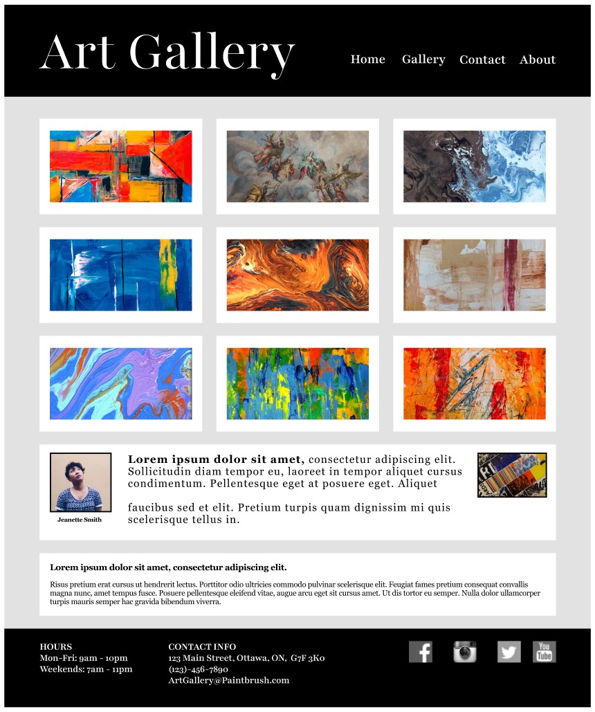
The Finished Homepage
Before diving into the artcle, here's a quick look at the artefact: a homepage for a fictional art gallery in Ottawa, designed in Figma. Every element on the page is there for a specific reason, explained below.
Three Things I Walked Away With
Why I Designed a Gallery Homepage
I spend most of my workday researching. Interviewing clients, synthesising findings and working with designers. Figma is already part of my daily work; I use it for research stimuli, quick wireframes to align on an idea, or simply to comment on design decisions when collaborating with others.
However most of my Figma work lives in project files that won't leave the organisation, and I didn't have a clean, self-contained piece I could point to in a portfolio conversation.
So I set a simple goal for myself: one small project that I created, end-to-end. Not a wireframe, not a sketch, but a page I could show others and say: "Yes, I made that!"
I decided to create a mockup for an art gallerys' homepage because, as a design subject, the content is the product. There is no room for clever interaction patterns to rescue a weak layout. If the gallery grid doesn't read as a gallery, the site has failed before a visitor has even scrolled. That constraint forced me to be honest about hierarchy, whitespace, and restraint, three things every homepage needs.
Three Key Questions
Before I opened Figma, I wrote down three questions and checked my decisions against them.
- Q1Who are my demographics?
- A walk-in looking for a Saturday outing, a local artist considering submitting work, and a returning patron checking-in to view the latest pieces.
- Q2What do they need?
- The work, the hours and contact details. Everything else can wait.
- Q3Where could there be business risk?
- A visitor who can't find the address or operating hours, so they leave the page. It's about communicating the essentials.
These notes helped keep me focused on a minimalist approach, and think like both a researcher and a designer.
Studying the Competitive Landscape
Before drafting the homepage, I spent an afternoon looking at small gallery websites. My goal was to see what kinds of layouts seemed to work an which ones didn't. I was also inspired by layouts from YouTube, Netflix and Prime Video.
A few patterns came out of the scan. I noticed that sites lead with a hero image, which makes sense, but a surprising number buried opening hours in the footer or on a separate "Visit" page. Other sites had no obvious signal for what was currently on the walls, just a generic grid that could have been from any timeframe. Only a handful made the featured artist feel like a person rather than a line of metadata, and I wanted to give them a bit of a hero section of their own.
Five Decisions, One Rule
From the beginning, I decided that I wanted to approach this design exercise from the perspective of a researcher. For me, that meant that every visual element needed a reason to be there. I wrote my thought process as I worked:
-
01
A 3x3 grid, not a carousel. Usability findings from the Nielsen Norman Group has found that carousels work poorly, especially when compared to a grid. Plus, a grid lets the eye compare, which helps people decide what they like.
-
02
A serif font at a generous scale. Galleries live in a long tradition and that's something a serif font can convey well.
-
03
Dark bands at top and bottom. A gallery wall is a neutral backdrop. Bright helps create contrast and frame the essential elements.
-
04
A featured artist, with a face. A name is metadata. A face is a person.
-
05
Hours, contact and socials, all together. When users want to find contact information, it should all be in one place they'd expect to find it.
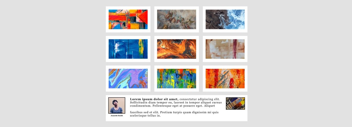
The 3x3 gallery grid: comparison, not carousel.
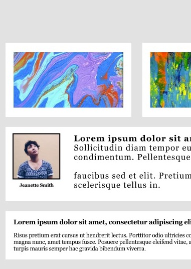
Featured artist: a face, not just a name.
How This Sharpened My Research
The point of the exercise was to keep my design-adjacent skills sharp, and to have something concrete to show for the effort. Four habits came back a little stronger.
Wrestling with layout decisions helps keep my research questions sharp. For example, it helps me tell the difference between a question a designer can answer versus one that's more about product strategy.
Exercises like this help keep the vocabulary fresh in my mind. For instance, being able to talk about franes, auto-layout and components all help iron-out potential miscommunications between research and design.
Hands-on exercises keep my sense of cost sharp. The difference between moving a component (cheap) and restructuring an entire flow (expensive) is easy to forget when you're less familiar with design. I find that staying familiar to design tools like Figma, Framer or Webflow helps me think about the kinds of solutions that can deliver the greatest impact at lowest cost.
Having my own design projects while thinking as a researcher helps me spot the kinds of places a user might experience friction. For example, they might think something like: "Is this a gallery name or a button?". The places where I had to make judgment calls without user data are exactly the places I would want to test next.
What I Would Test Next
A design is a constant work in progress. Even when we feel satisfied enough to launch the product, there's always room for improvement by way of user testing and iteration. Some user testing I'd conduct on this design would be:
First, a short unmoderated usability test with ten to twelve participants, running the three tasks my original brief implied: find out what's showing now, find the opening hours, and find contact information. I'd measure succes rates, satisfaction with time on task, ease of use and confidence scores.
Second, a quick qualitative study with four or five participants to see what users like and dislike about the design; what they find helpful, unhelpful and how they feel about key design decisions, such as the hero section near the bottom of the page.
Third, another lightweight qualitative session with four to five visiting artists, to assess their likes and dislikes about the layout and hero section. Artists and visitors are different user groups, so I'd' want to hear how the page can be improved to serve those user groups, at a minimum.
Each of those evaluations map back to a specific assumption I made. That traceability, from initial assumptions to testing, is part of what makes research and design exciting to me, and it's a reason why I enjoy doing small self-directed projects like this one.
Let's connect
Looking for a hands-on researcher?
Send a message and I'll get back to you within 24 hours.